- i think the only challenges was getting a picture with lines. and rule of thirds.
- i thought about focusing the most. i didn't want the pictures to be too far away or too close.
- i would go to classes that are more active and make sure to really focus on following all six rules of photography.
- i actually don't like ay of my pictures.
- the easiest one i think i'll achieve is the simplicity one.
- i think the hardest to capture would be the lines photo.
- i'm still not totally clear on the rule of thirds.
Tuesday, October 8, 2013
Academic Shoot Reflection

Academic Shoot
Balance

the subject is the girls and i think its clear to people. i could've taken a different picture for it because this one is just bad and boring.
Frame

the subject is Mr. Fischer and i think it would be pretty clear to people. i think its an okay picture but i could've taken it way better. not so far away.
Lines

the subject is the lines on the wall and i think it's pretty clear too. i could've taken a better less boring picture of something that consists of lines.
Merger

the picture sucks like it's supposed to. i cut off the people at the front and it looks like her body is cut off where he is sitting down.
Simplicity

the walls are a simple background and the subject is Mrs. Bagnall. i like this picture and i think it's a good example of simplicity. but it is a little blurry.
Wednesday, October 2, 2013
Academics Photo Shoot Review

I chose this photo because it shows how the kids are interacting in the group they're in. The rules of photography they're using are lines, balance, the rule of thirds, and they're avoiding mergers.
I think I could take photos like the ones today in a science or english room or the library.
Mabe Mrs. Bagnall's room, Sells, or any other science or english teacher.
To try and get photos like i saw today i'll really have to get them of kids interacting with each other and showing they're learning. Or blowing things up in science class.
best story

The kids are interacting with their teacher in a funny way. The girl is messing with his papers at his desk, the guy is playing with his head, and the teacher has his hands up not knowing what to do but laugh about it.
fills the frame

The frame is filled with all of the students and whatever science experiment they're all participating in, in the middle.
Best Action/Emotion

The girls are really surprised about what's taking place in their science lab/experiment. There's water in the air and all over the counter!
Monday, September 30, 2013
Elements of Art & Principles of Design
ELEMENTS OF ART
- Lines are marks made by a pointed tool: brush, pencil, pen, etc. Lines can vary in width, direction, curvature, length, or color.

I chose this painting because of the black line that stands out that's used to draw the bull.

I chose this photo because of the lines that create the bridge.
- Shapes are formed wherever the ends of a continuous line meet. Geometric shapes such as circles, triangles or squares have perfect, uniform measurements and don't often appear in nature. Organic shapes are associated with things from the natural world, like plants and animals.

I chose this painting because of all of the different shapes that were used to create it.

I chose this photo because of the obvious shapes created by the fence.
- Color wheels show the primary colors, secondary colors, and the tertiary (intermediate) colors. They also show the relationships between complementary colors across from each other, such as blue and orange; and analogous (similar or related) colors next to each other such as yellow, green, and blue. Black and white may be thought of as colors but, in fact, they are not. White light is the presence of all color; black is the absence of reflected light and therefore the absence of color.

I chose this painting because of it's colorful.

- Value, or tone, refers to dark and light; the value scale refers to black and white with all gradations of gray in between. Value contrasts help us to see and understand a two-dimensional work of art.
I chose this photo because the different colors of the light stand out.

I chose this picture because of the black and gray.

I chose this photo because it shows a lot of black and gray.
- Form describes objects that are three-dimensional, having length, width, and height.

I chose this painting because the objects have a lot of form.

I chose this photo because these objects are three-dimensional.
- Texture can be rough, bumpy, slick, scratchy, smooth, silky, soft, prickly--the list is endless. Texture refers to the surface quality, both simulated and actual, of artwork.

I chose this painting because it has a lot of texture to it.

I chose this photo because it looks really smooth.
- Space refers to distances or areas around, between, or within components of a piece. Space can be positive (white or light) or negative (black or dark), open or closed,shallow or deep, and two-dimensional or three-dimensional.

I chose this picture because of the space between the people.

I chose this photo because of the space between the shoes.
PRINCIPLES OF DESIGN
- Balance is the comfortable or pleasing arrangement of things in art. There are three different types of balance: symmetrical, asymmetrical, and radial. The human figure is symmetrically balanced; the same on the left and right side. The tree is asymmetrically balanced; its branches are not distributed equally on each side, but their total weight is balanced left and right. The sun is an example of radial balance; all its rays are equal in length from the center.

I chose this photo because the sun is an example of radial balance.

I chose this photo because on the butterfly, everything that is on the left is the same on the right.
- Contrast is created by using elements that conflict with one another. Often, contrast is created using complementary colors or extremely light and dark values. Contrast creates interest in a piece and often draws the eye to certain areas. It is used to make a painting look interesting.

I chose this painting because the contrast of the orange makes the flower stand out.

I chose this photo because the contrast in the colors of the rainbow makes it stick out really well and it looks really cool.
- Emphasis in the focal area of an artwork gives it importance. An artist may stress some elements of the design over others. The eye of the viewer will focus on the area of emphasis or center of interest first, then take in the rest of the composition.

I chose this painting because the flowers are the center of first interest because they're in color instead of black and white.

I chose this photo because the eye of the viewer focus on the purple flower instead of anything else.
- Movement in an artwork means the artist is taking viewers on a trip through the work by means of lines, edges, shapes, and colors often leading to the focal area. Movement is a visual flow through the composition. It can be the suggestion of motion in a design as you move from object to object by way of placement and position. Directional movement can be created with a value pattern. It is with the placement of dark and light areas that you can move your attention through the format.

I chose this painting because of the movement of the waves.

I chose this photo because the photographer caught the women while they were in motion.
- Patterns are made in art when the same shapes or elements are repeated again and again. Pattern uses the elements of art in planned or random repetitions to enhance surfaces of paintings or sculptures.
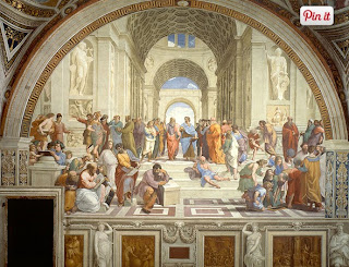
I chose this painting because of the patterns around the whole painting.

I chose this photo because its just one big picture full of patterns.
- Rhythm is the repetition of shapes, lines, and forms. Rhythm is a movement in which some elements recurs regularly. Like a dance, it will have a flow of objects that will seem to be like the beat of music.

I chose this painting because of the repetition of the faces of the people in the picture.

I chose this photo because of the repetitions of the signs along the road.
- Unity means that all elements in an artwork are in harmony. Unity brings together a composition with similar units. For example, if your composition was using wavy lines and organic shapes you would stay with those types of lines and not put in even one geometric shape.

I chose this painting because all elements in the painting are in harmony. They stayed using the people and just moved them in different directions.

I chose this photo because all of the boats were brought together and united.
Subscribe to:
Posts (Atom)